Now that we have our posts content type setup and a collection of sample entries, let's use them. I'm thinking we should add a new Posts page which lists all of the posts, showing their title, a short summary, an image and a link to read the entire article.
Creating a basic listing
Let's add a page to list all our posts. You know the drill.
$ bundle exec wagon generate page posts
Do you prefer a HAML template ? no
      create  app/views/pages/posts.liquid
Start by cleaning up the header.
---
title: Posts
published: true
listed: true
position: 1
---
In our navigation menu, I would like this posts page to come right after the home option, so I set the position to 1. However, about.liquid also has it's position set to 1, so open about.liquid and change the position to 2.
Onto the body. Paste in the following code. {% extends parent %}
{% block main %}
  <div class="posts">
    {% for post in contents.posts %}
      <div class="post-listing">
        {% if post.featured_image.url %}
          <img src="{{ post.featured_image.url | resize: '400x200#' }}" alt="{{ post.title | escape }}">
        {% endif %}
        <div class="caption">
          <h3>{{ post.title | escape }}</h3>
          <div class="teaser">{{ post.teaser }}</div>
          <p><a href="/posts/{{ post._slug }}">Read More</a></p>
        </div>
      </div>
    {% endfor %}
  </div>
{% endblock %}
Let's go over this line by line.
First, we declare that the template will extend its parent template (in this case, index.liquid).
{% extends parent %}
Then we open a new block, main, which will overwrite the content of the main block in the parent template, index.liquid. We also open a new div tag with the class posts to hold all of our post listings.
The following line starts a for loop.
{% for post in contents.posts %}
The contents droplet gives us access our content entries collections. contents.posts is a list containing all the posts. Since we are using the wagon server, the variable is populated with the entries from data/posts.yml. The syntax of the for loop should be familiar to programmers: for every item in content.posts, put that item into the post variable and then execute the following code.
<div class="post-listing">Our loop begins by opening a new div tag with the class post-listing for each post.
{% if post.featured_image.url %}
    <img src="{{ post.featured_image.url | resize: '400x200#' }}" alt="{{ post.title | escape }}">
{% endif %}
As you may remember, the featured_image field was optional. So, an if tag checks to see whether this post has an image. But what's this .url business? File fields for content types have several properties by default, including:
url: the file's full URLsize: the file's size in bytesfilename: the file name (without the path)
If the editor has left the featured image field blank, then then the URL will be blank, so we can use the url property to see if an image has been uploaded.
If there is an image, it creates a new image tag, using the trusty resize filter to make the images consistently 400 pixels wide and 200 pixels tall. For the image's alt field, we've specified the post's title, and escaped it with the escape filter.
<h3>{{ post.title | escape }}</h3>
An <h3> tag is used to display the post's title.
<div class="teaser">{{ post.teaser }}</div>
Next we've inserted the post's teaser into a <div> tag. Note that we didn't escape this field, because, as we specified in our app/content_types/posts.yml file, this field is already in HTML format. The rich text editor in the back-office will format the content in HTML, including wrapping paragraphs in <p> tags, which is why we've wrapped the field in a generic <div> tag.
<p><a href="/posts/{{ post._slug }}">Read More</a></p>
Finally, we add a link to read the entire article. The _slug field is built-in to all content types. That underscore is there because this is a built-in. This useful convention ensures there isn't a conflict if you need to have your own field named slug.
The _slug field holds a URL friendly string used to identify the content type in URLs. URL friendly means it is all lowercase, has no special characters, and uses dashes instead of spaces. You can manually specify content slugs if you wish, but by default LocomotiveCMS will generate slugs based on the content type's label. As we specified in app/content_types/posts.yml, the label field for our posts content type is title. So if a post's title is Guess who's coming to dinner?, the resulting slug will be guess-whos-coming-to-dinner.
Slugs are also permanent. If a site editor later changes the title to be Guess who's coming to dinner, tonight?, the slug won't change (unless you do so manually), meaning your site's URLs are permanent and can be linked to with confidence.
Another cool feature of slugs is that they are effortlessly unique. Let's say that in the future I create another post named Guess who's coming to dinner? When LocomotiveCMS automatically generates its slug, it will add a number in order to keep it unique. So, in this case the slug would become guess-whos-coming-to-dinner-1.
Back to our posts.liquid template, the read more link goes to the post's URL: /posts/{{ post._slug }}. We haven't made a template to respond to that link yet, but we will.
After that, we just close the divs, loop, and block.
      </div>
    {% endfor %}
  </div>
{% endblock %}
Styling the post listings
Let's preview this page with the wagon web server. Shield your eyes, it won't be pretty.
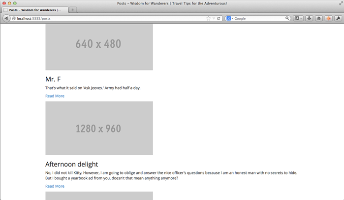
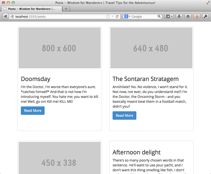
Not as bad as I thought. One thing I like is how resize normalized all the image sizes for us. That being said, the listing still has a long way to go. Let's spruce up these post listings using some Bootstrap's built-in classes. Replace the posts.liquid body with the improved code below.
{% block main %}
  <div class="row posts">
    {% for post in contents.posts %}
      <div class="post-listing col-sm-6 col-md-4">
        <div class="thumbnail">
          {% if post.featured_image.url %}
            <img src="{{ post.featured_image.url | resize: '400x200#' }}" alt="{{ post.title | escape }}">
          {% endif %}
          <div class="caption">
            <h3>{{ post.title | escape }}</h3>
            <div class="teaser">{{ post.teaser }}</div>
            <p>
              <a href="/posts/{{ post._slug }}" class="btn btn-primary">
                Read More
              </a>
            </p>
          </div>
        </div>
      </div>
    {% endfor %}
  </div>
{% endblock %}
The opening div now implements the Bootstap row class. For those who have never used Bootstrap, now might be a good time to read a little about Bootstrap's grid system.
The post div now implements two more Bootstrap classes: col-sm-6 and col-md-4. In other words, for medium (laptop-ish size) and larger, there will be three posts per row. For small (tablet-ish size) screens, there will be two two posts per row. I didn't specify extra small, so on phone-ish size screens, the rows will collapse, resulting in one post per row.
The following line adds a new div using Bootstrap's built-in thumbnail class, which gives the post listing a nice outline. The final change is that the Read More link now uses two Bootstrap classes to style it as a button. Let's see how this looks.
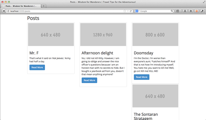
Hmm...better, but not exactly what I had in mind. Since the divs all have different heights, the posts aren't breaking cleanly into rows. Fortunately, I know a little trick to make this work.
Add the following two lines just before the {% endfor %} tag.
{% cycle '', '<div class="clearfix visible-sm"> </div>' %}
{% cycle '', '', '<div class="clearfix hidden-sm hidden-xs"> </div>' %}
On the first line, we meet a new Liquid tag: {% cycle %}. This nifty tag cycles through specified values. Examine the example below. Assume that we have an array called numbers which holds the values one to ten.
{% for number in numbers %}
  {{ number }}: {% cycle 'red','green','blue' %}<br />
{% endfor %}
Would print the following
1: red
2: green
3: blue
4: red
5: green
6: blue
7: red
8: green
9: blue
10: red
Back on our posts page, the first cycle tag specifies two values: an empty string and a div tag. The div tag is empty except for a non-breaking space, but it implements Bootstrap's clearfix so that the next element breaks onto a new row. It also implements visible-sm, which means it will be visible on small screens, but hidden on extra-small, medium, large, and extra-large screens.
Im summary, after every second post, cycle will insert a div tag which breaks the next element to a new row on small screens only.
The following cycle tag is similar. The first two values are empty strings. The last value is again a div implementing clearfix. This div implements hidden-sm and hidden-xs, which means it will be hidden on small and extra-small screens, but visible everywhere else (medium, large, and extra-large screens).
To summarize: after every third post, cycle will insert a div tag which breaks the next element to a new row on medium and larger screens.
Sounds like just the ticket. Let's see what it looks like.
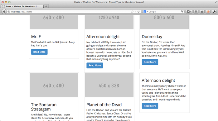
Getting closer, but no cigar. The rows are too close together, and I don't like that thumbnails in the same row aren't the same height.
Easy fix first: add this to public/assets/styles.css.
/* posts.liquid */
body.page-posts div.post-listing {
  margin-bottom: 20px;
}
That solves the spacing, but what about the heights? Everyone knows that equalizing heights with CSS will cost you your youth, so I'm thinking JavaScript. There are plenty of plugins that do this, but it will probably be as simpler to implement it ourselves. Add the following two functions to the top of public/assets/javascripts/main.js.
function equalizeHeights(items) {
  var maxHeight = 0;
  items.each(function() {
    if ($(this).height() > maxHeight) { maxHeight = $(this).height(); }
  });
  items.each(function() { $(this).css('min-height', (maxHeight + 10) + 'px'); });
}

function formatPostListings() {
  var posts = $('body.page-posts div.posts div.thumbnail');
  posts.each(function(){ $(this).css('min-height', "0px"); });
  if( $(window).width() >= 992 ) {
    for(var i = 0; i < posts.length; i+=3) { equalizeHeights( posts.slice(i, i+3) ); }
  } else if ( $(window).width() >= 768 ) {
    for(var i = 0; i < posts.length; i+=2) { equalizeHeights( posts.slice(i, i+2) ); }
  }
}
And then add the following two lines inside the $(document).ready block.
$(window).on('load', formatPostListings);
$(window).on('resize', formatPostListings);
I won't go over every line of this, but basically, when the window is first loaded and every time it is resized it called the function formatPostListings. This function, depending on the screen size, resizes the posts on a row by row basis (keeping in mind that smaller screen have less posts per row).
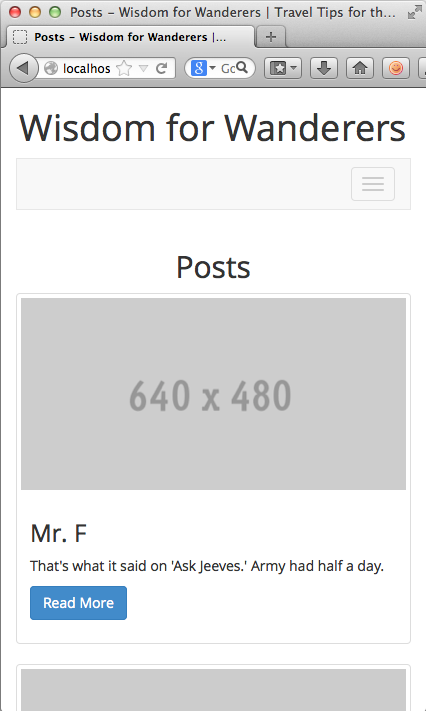
Time to preview the site again.
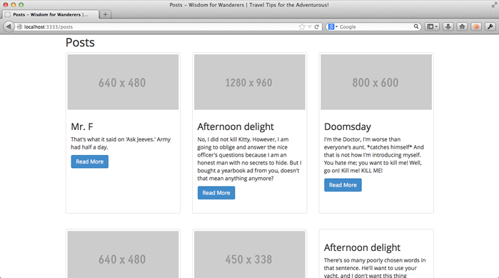
Looks great! Let's squish the browser up a bit to simulate viewing the site on a tablet.
Still looking good. Now for phones.
Beautiful. Let's finish up.
Finishing up
Today was action packed. We met a new global variable, contents, used two new Liquid tags, cycle and for. Plus we learned about slugs for content types. We also spent some time fiddling with Bootstrap classes and JavaScript to equalize div heights, things that are probably a little outside this tutorial's scope. But, I figure if we're making a fake blog, it might as well be a good one.
Let's save our changes the git repository.
$ git add app/views/pages/about.liquid app/views/pages/posts.liquid
$ git add public/stylesheets/styles.css public/javascripts/main.js
$ git commit -m "Added a page to list the posts."
Stayed tuned for the next chapter where we will enhance the posts page even further with pagination.
Next: pagination