One topic we haven't yet dug into is assets. For most sites, in addition to the pages you'll want to add style sheets, JavaScripts, custom fonts, and images. Let's look at how to use these in LocomotiveCMS.
Images
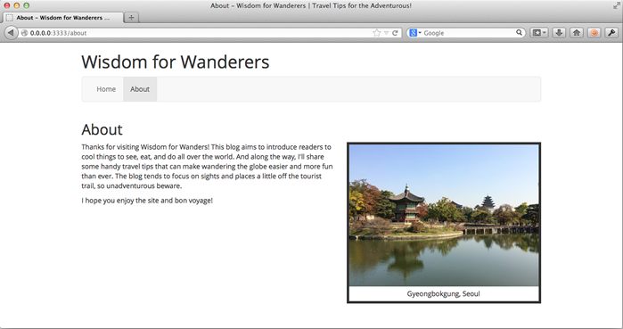
The site is pretty bland. Let's spice up the About page with a photo.
As I mentioned briefly in the beginning, you can use the public/samples directory for images, as our Bootstrap 3 template does. In fact the template has preloaded some Bootstrap icons as placeholders, but we won't be needing them, so let's go ahead an delete everything currently in the public/samples directory.
While you can use public/samples directory for all of your images, I prefer to use the samples directory only for images attached to content entries or editable items, topics we will get to later. For images that are just a part of the site's design, such as a logo or the photo we are about to add, I prefer to use the public/images directory.
Let's create the public/images directory and add a photo that matches with our site. I'm going to use this handsome photo of Seoul's Gyeongbokgung: gyeongbokgung-full.jpg. You're welcome to use this photo if you like, or provide your own photo.
Now open app/views/pages/about.liquid and add the following line just above the first paragraph of text.
<img src="{{ 'gyeongbokgung-full.jpg' | theme_image_url }}" alt="Gyeongbokgung" />
Can you guess what theme_image_url does? Like the stylesheet_url filter we encountered earlier, it creates an absolute path to the image that works both in Wagon and Engine. Let's take a look. Start Wagon's built-in web server and open http://localhost:3333/about in your web browser.
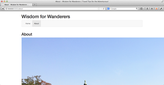
Whoa, nelly. The image is way too big, but don't open your image editor. I am about to show you one of LocomotiveCMS's cool features.
<img src="{{ 'gyeongbokgung-full.jpg' | theme_image_url | resize: '400x' }}" alt="Gyeongbokgung" />
Meet resize. This filter let's us serve resized images. To be clear: this image isn't being resized with CSS or HTML. The image is resized with Imagemagick to given specifications and then cached so that it can be instantly served to visitors.
This is a huge timer saver. What if the design changes again and we want use a different size of the image? Just change the resize string. Want to crop it? Change the resize string. Want to serve different sizes of the same image depending on their screen resolution using CSS? One image, several resize strings. And this isn't even getting into its uses with images uploaded by site editors where you can't first use your image editor, even if you wanted to.
Resize strings use the basic format of width x height and are measured in pixels. Here are some common resize strings.
'400x'      # resizes to 400 pixels wide, keeps aspect ratio
'x300'      # resizes to 300 pixels tall, keeps aspect ratio
'400x300!'  # resizes to 400 x 300 pixels, changing aspect ratio if necessary
'400x300#'  # like above, but crops with center gravity to maintains aspect ratio
'400x300>'  # resizes only if the image is larger than 400 x 300 pixels
'400x300<'  # resizes only if the image is smaller than 400 x 300 pixels
The resize string is interpreted by the DragonFly gem. For a complete guide to what is possible, check out the resize filter documentation.
Let's take another look at our page.
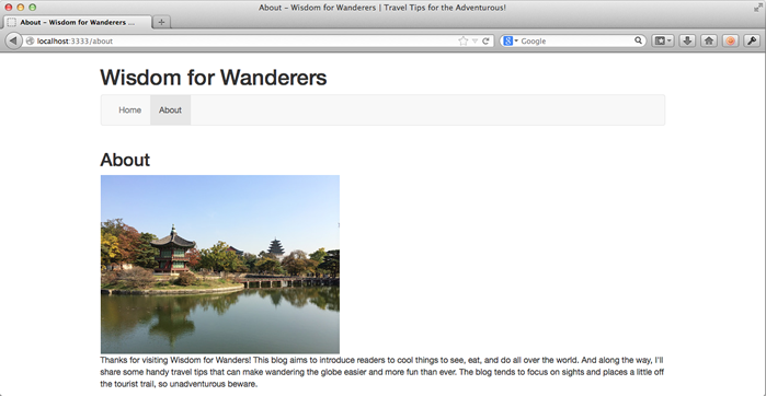
Great, our image has been resized! On to styling it.
Stylesheets
Let's make the About page easier on the eyes by providing some nice styles for the image. Disclaimer for designers in the audience: I probably couldn't design my way out of a paper bag, so please excuse my "minimalistic" design choices.
Open app/views/pages/index.liquid and add the following line just below the bootstrap.min.css link tag.
{{ 'styles.css' | stylesheet_tag }}
Let's also add a class to the page's body tag.
<body class="page-{{ page.slug }}">
This uses the page's slug to make a unique CSS class for each page. This is useful as it let's us put all of our CSS in a single file. When we want certain styles to apply only on specific pages, we can use this CSS class.
Now create public/stylesheets/styles.css and paste in the following code.
/* a nice frame for images */
div.img-box {
  border-width: 5px;
  border-style: solid;
}

div.img-box img {
  max-width: 100%;
}

div.img-box p {
  margin: 5px;
  text-align: center;
}

/* phones */
@media (max-width: 767px) {
  body.page-about .img-box {
    width: 300px;
    margin: 0px auto 10px auto;
  }

  h1, h2 { text-align: center; }
}

/* tablets and up */
@media (min-width: 768px) {
  body.page-about .img-box {
    width: 400px;
    margin-left: 20px;
    float: right;
  }
}
This is just regular CSS, so it should be pretty clear. First, the file defines a global img-box class that we can apply to div tags. The div will wrap the image in a border, make the image responsive, and center its caption. From there, we define some page specific styles that are dependent on the client's screen resolution. I've also decided to center the site and page titles on phone sized devices.
The last step to applying these styles is the add the img-box class to our image in app/views/pages/about.liquid. We can do that by replacing our current image with the code below.
<div class="img-box">
  <img src="{{ 'gyeongbokgung-full.jpg' | theme_image_url | resize: '400x'  }}" alt="Gyeongbokgung" />
  <p>Gyeongbokgung, Seoul</p>
</div>
This also adds a caption below the photo. Let's preview this in our browser.
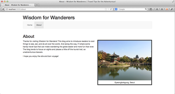
Looks nice. Now squish the browser up a little so you can see how our responsive, phone oriented styles look.
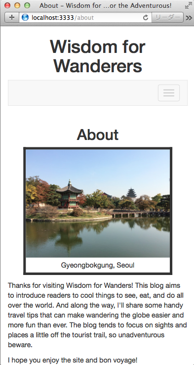
That looks great too. We still have two more assets to cover, so let's keep moving.
JavaScript
JavaScript support in LocomotiveCMS is pretty simple: put your JavaScript files in the public/javascripts folder. Then link to the files with a javascript_tag or javascript_url filter.
Let's try it out by making a very simple light box for our photos, so that if we click a photo, it displays a larger version. Of course we could use one of the thousands of light box plugins already out there, but we're going to make our own this time.
First thing we need to due is include a link to a larger image in about.liquid.
<div class="img-box">
  <a href="{{ 'gyeongbokgung-full.jpg' | theme_image_url | resize: '800x' }}">
    <img src="{{ 'gyeongbokgung-full.jpg' | theme_image_url | resize: '400x'  }}" alt="Gyeongbokgung" />
  </a>
  <p>Gyeongbokgung, Seoul</p>
</div>
Here we make our image a link to a large version of the image, again using the handy resize filter to generate a large version of the photo.
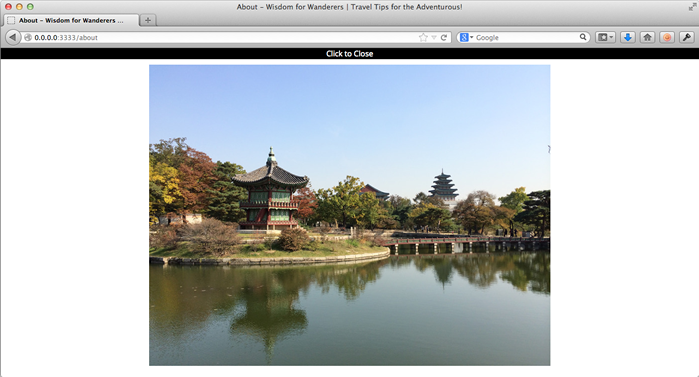
Now let's add some JavaScript. Create a new file public/javascripts/main.js and add the following contents.
$(document).ready(function(){

  // if they click on a boxed image, enlarge it
  $('div.img-box a').click(function(event) {
    event.preventDefault();
    var box =
      '<div id="lightbox">' +
      '<p>Click to Close</p>' +
      '<img src="' + $(this).attr('href') + '" alt="Enlarged" />' +
      '</div>';
    $('body').append(box);
  });

  // if they click an enlarged image, close it
  $('body').on('click', '#lightbox',function(event) {
    $('#lightbox').remove();
  });

});
This simple script uses jQuery to add a light box to every img-box image. If they click on the image, it creates a light box showing an enlarged version. If they click the light box, it closes.
Of course this script won't do anything if we don't include it, so add this line underneath the bootstrap.min.js script tag in index.liquid.
{{ 'main.js' | javascript_tag }}
The only thing left to make this work is some CSS, which we can put just under the img-box styles in styles.css.
/* if they click on a boxed image, enlarge it */
#lightbox {
  position: fixed;
  top: 0px; left: 0px;
  width: 100%; height: 100%;
  padding-bottom: 50px;
  text-align: center;
  background-color: #fff;
  z-index: 1000;
}

#lightbox img {
  max-width: 100%;
  max-height: 100%;
}

#lightbox p {
  background-color: #000;
  color: #fff;
}
This CSS styles the light box and ensures the enlarged image fits on their screen. Let's preview our new feature.
It works! Three assets down, one to go.
Fonts
To demonstrate LocomotiveCMS's support for custom fonts, we are going to change our site to use a non-standard font. I'm going to use Open Sans.
Actually, Open Sans is supported by Google's excellent Web Fonts service, so if this were a real site, I would probably just use Google Web Fonts to handle the font files. But for the sake of learning, we're going to pretend that Open Sans isn't available on Google Web Fonts and walk through adding the font with our own files.
For truly cross-browser compatible custom fonts, we need the font in four formats.
- woff: an compressed standard currently supported by the latest versions of all major Desktop browsers and the latest versions of many mobile browsers
- eot: needed to support Internet Explorer 6, 7, and 8
- svg: needed for some mobile browsers, including older versions of iOS Safari
- ttf: support for older, non-IE desktop browsers and some older mobile browsers
We can download all of these versions from FontSquirrel. Click on the Webfont Kit tab, leave all the formats selected, and click the download button. After it downloads, create a new directory in the project folder: public/fonts/open_sans/. Now move the woff, eot, svg, and ttf files for the regular and italic versions of Open Sans from the Webfont Kit into the directory.
You should now have the following eight files in the directory.
$ ls -1 public/fonts/open_sans
  OpenSans-Italic-webfont.eot
  OpenSans-Italic-webfont.svg
  OpenSans-Italic-webfont.ttf
  OpenSans-Italic-webfont.woff
  OpenSans-Regular-webfont.eot
  OpenSans-Regular-webfont.svg
  OpenSans-Regular-webfont.ttf
  OpenSans-Regular-webfont.woff
Next, create a new CSS file, public/stylesheets/fonts.css. Define these fonts by pasting the following code into the file.
@font-face {
  font-family: 'Open Sans';
  src: url('../fonts/open_sans/OpenSans-Regular-webfont.eot');
  src:
    url('../fonts/open_sans/OpenSans-Regular-webfont.eot?#iefix') format('embedded-opentype'),
    url('../fonts/open_sans/OpenSans-Regular-webfont.woff') format('woff'),
    url('../fonts/open_sans/OpenSans-Regular-webfont.ttf') format('truetype'),
    url('../fonts/open_sans/OpenSans-Regular-webfont.svg#open_sansregular') format('svg');
  font-style: normal;
}

@font-face {
  font-family: 'Open Sans';
  src: url('../fonts/open_sans/OpenSans-Italic-webfont.eot');
  src:
    url('../fonts/open_sans/OpenSans-Italic-webfont.eot?#iefix') format('embedded-opentype'),
    url('../fonts/open_sans/OpenSans-Italic-webfont.woff') format('woff'),
    url('../fonts/open_sans/OpenSans-Italic-webfont.ttf') format('truetype'),
    url('../fonts/open_sans/OpenSans-Italic-webfont.svg#open_sansitalic') format('svg');
  font-style: italic;
}
Of course, we'll also need to link to this file in index.liquid, just above the styles.css link tag.
{{ 'fonts.css' | stylesheet_tag }}
Finally, add these lines at the top of styles.css to set Open Sans as the default font.
/* make Open Sans the default font */
body * {
  font-family: 'Open Sans', sans-serif;
}
Our custom font should now be working. Let's check.
Voilà, our site now uses Open Sans.
Finishing up
Let's save our changes to the git repository.
$ git add public/fonts/open_sans public/images
$ git add public/stylsheets/styles.css public/stylsheets/fonts.css
$ git add public/javascripts/main.js
$ git add app/views/pages/index.liquid app/views/pages/about.liquid
$ git add -u
$ git commit -m "added a photo to the about page including border styles and a light box, changed font to Open Sans"
Well that's the basics of using assets with your LocomotiveCMS project. Those looking to do more, such as using preprocessors like CoffeeScript, SASS, or LESS, can find more information here.
Next: editable elements